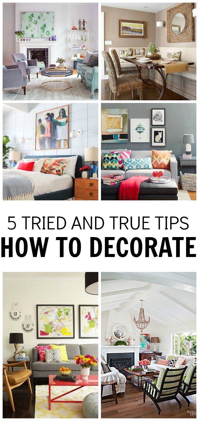
How do I decorate…..? One of the most asked questions I get…..
…..it’s a great question for sure.
I think that if you asked 10 people you would probably get 10 different answers. The thing about design is that it is all about feeling the space with your creativity…..but,
……I will say that there are few keys elements to pulling off an AMAZING space. I came up with a few top tips for decorating your space.
Join the Hawthorne and Main community to never miss a Decorating Tip!
1. Throw Pillows:
All pillows are created equal….no. A big fat no… A designer pillow is big and fluffy, not small and stiff. Picking up a few down-filled, large pillows will instantly make your space more comfortable and stylish. There are some great synthetic options too, just make sure they are soft and plush.
Plus, once you purchase a great pillow the options are endless on how many different pillow covers you can make and switch out throughout the year. Think of a great pillow as an investment to your homes overall design.
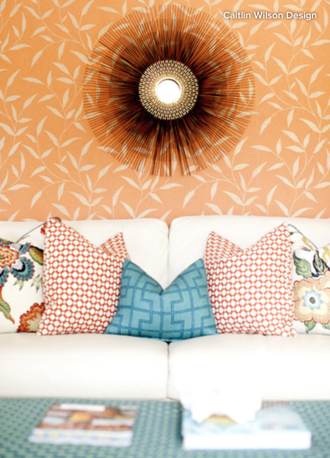
Have you ever heard of the “designer’s chop” on top of a pillow. It is the chop that lets you know if a pillow is soft and plush rather than hard and bulky. Get rid of those hard flat pillows.
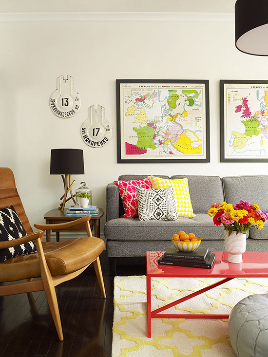
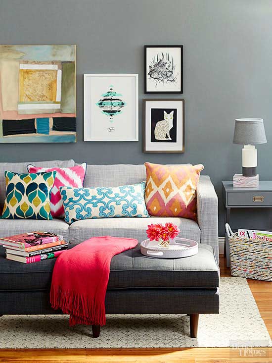
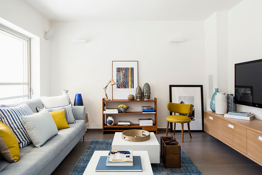
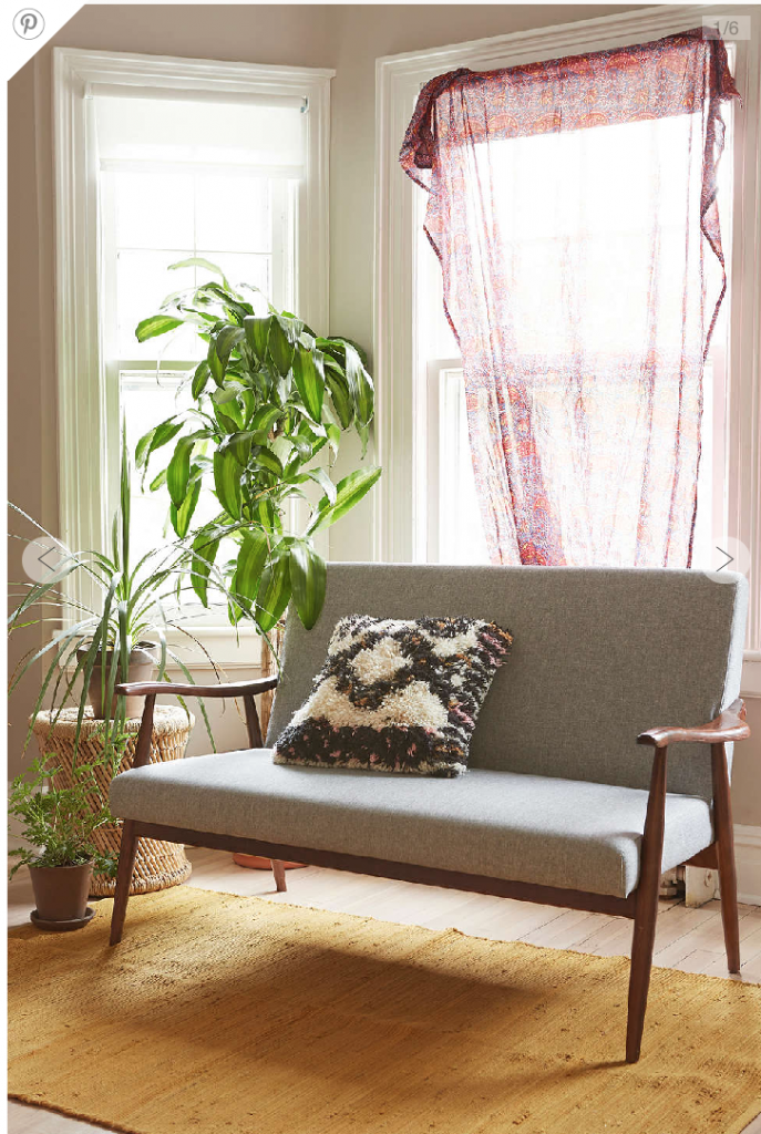
The image below is a good example of the “designer chop” I am referring too. Even though you cannot touch those pillows you can still get a sense for how soft and fluffy they are, can’t you!!
Lets talk about arranging pillows…
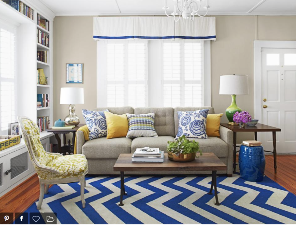
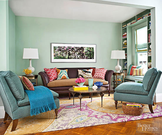
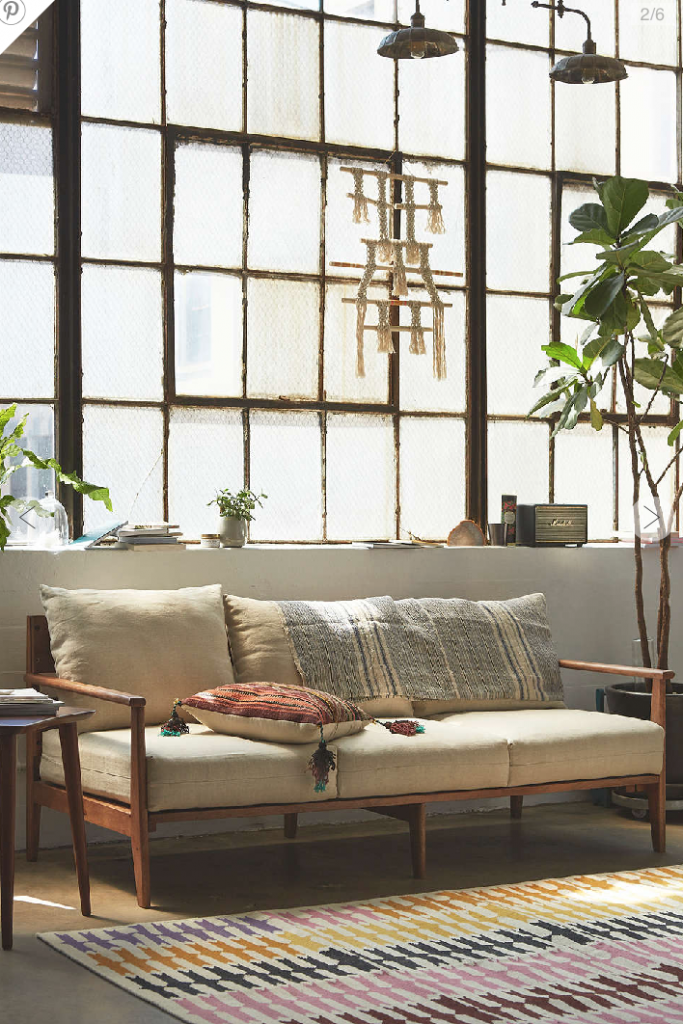
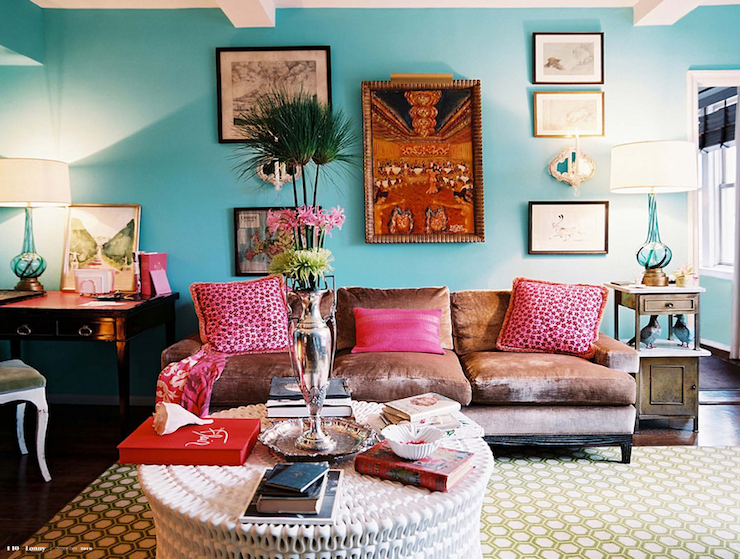
There any many many different ways to arrange pillows. Sometimes you can have all different shaped pillows with all different patterns, like the image below.
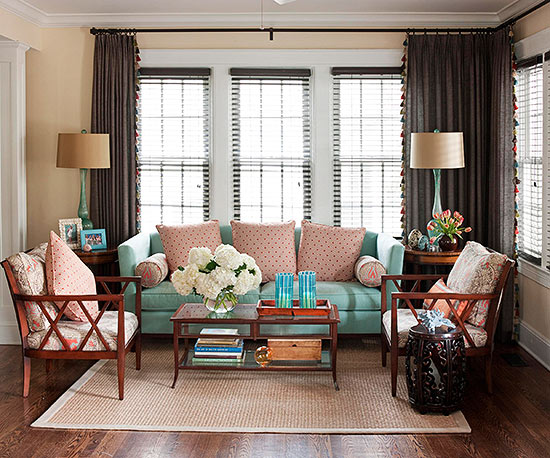
You can have just 3 pillows at either end of the couch.
Try out three on one side, with two on the other.
Or, you can have them all match.
Even with all of the different ways to arrange pillows there are a few key things to keep in mind….
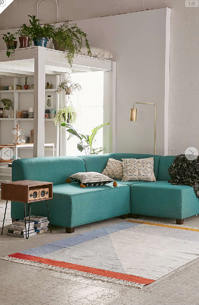
If you look at all of the pillows in the examples above you will notice one thing…..all of the pillows pull colors that already exist in the room, keeping the color pallet to 3-4 colors. You want your pillows to add to the overall theme rather than stick out like a bump on a log.
This does not mean that they all need to match or even be the exact same color. Try to mix large prints with smaller prints. Throw in a few solids to balance it all out.
The big question is this….How do you do it…. practice, practice….. change out your pillows, rearrange them. Sometimes it takes time to find the perfect color/pattern combination….but it’s ok. Your home doesn’t need to perfect immediately. You got this!
2- Hang Artwork
Often times people fall into the trap of hanging their artwork too high…..don’t do it!
Art is to be hung in proportion to the eyes….because, well, the eyes see the art. For most people this is around 57-60 inches. In other words, you should be hanging your art work so that the middle of the art piece is about 60 inches from the floor.
If you are hanging art work above a couch, chair, or bed hang it about 8 inches above the top of the furniture. This way you won’t hit your head on it when you sit down.
With that said….. go big. It is so easy to fall into the trap of picking art that is too small. See the image below. This one has the pictures hung way to high and they are way to small.
Pro Tip:
Add a piece of art to your wall… step back and take a picture. Look at the pictures and think to yourself if you saw this image on Pinterest or in a magazine would you think that it was too high or too low? Too small? Centered in the space properly. I use this method all the time.
One last tip on how big your art should be. The art that you choose should cover one half to two thirds of the space you are trying to fill. Going big doesn’t mean you only can have one piece of art on the wall either. Try adding two or three larger pieces to make up a really big area. I will be doing an entire post on how to hang a gallery wall.
3- Arranging Furniture on a Rug
Rugs are another great statement piece that can quickly update any space…. if you use them right!
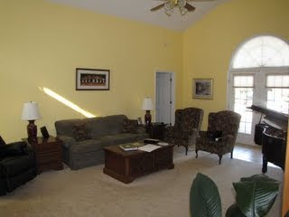
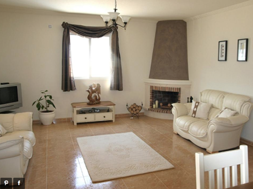
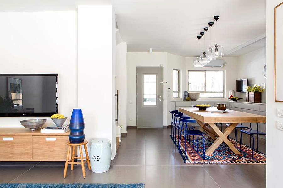
Please, please, don’t fall into the floating rug trap. See image above….
….this rug is just floating in the middle of the room, it has no connection to any of the furniture.
Lets talk about the best ways to lay out your rug.
#1 All the Furniture- off the rug:
Having all the furniture off the rug is great for small spaces and cost effective. You might be saying, this is the same as the floating rug…… it’s not. This rug is pushed all the way up close to the furniture…..but it’s actually not under any of it. You want the rug to be an extension of your design and decor. If it’s just left hanging out in the middle of the room then it will feel more like an island rather than an extension.
2- All the furniture- on the rug:
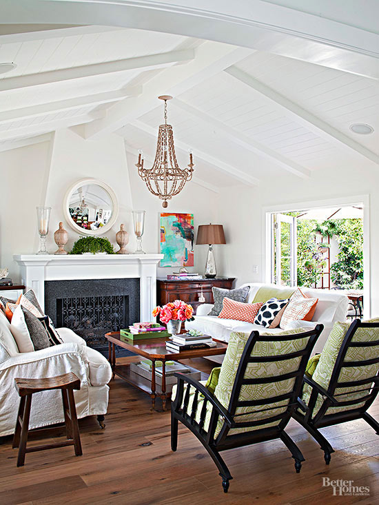
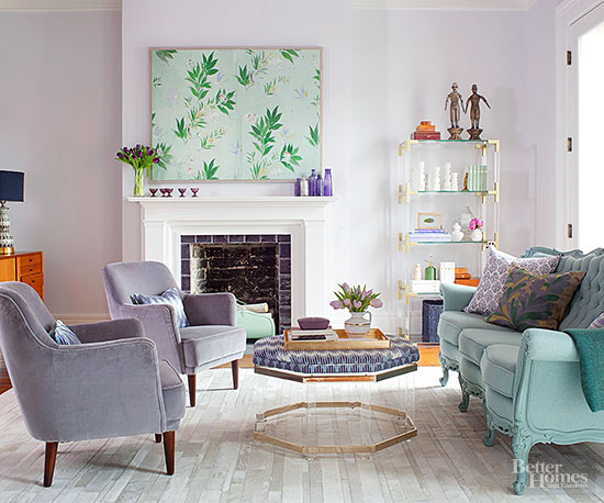
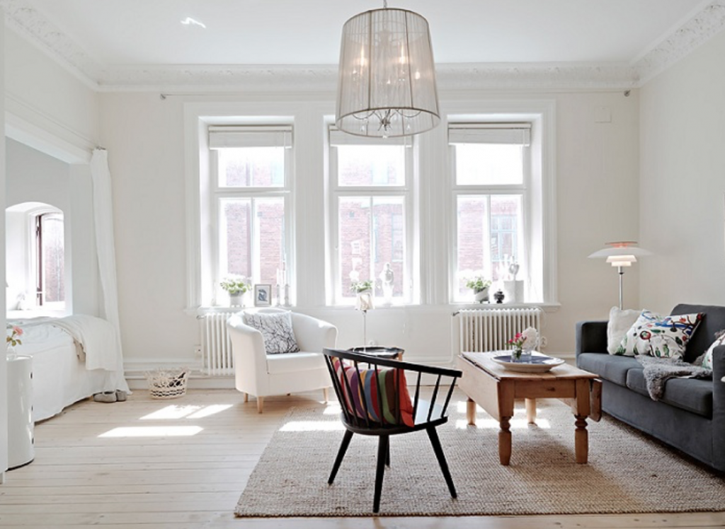
This really works best with a larger area rug. Having all the furniture on the rug almost creates a space within a space. It also makes the space feel more luxurious. In the image below you can definitely feel where the sitting area is. The rug is the boundary, so to say.
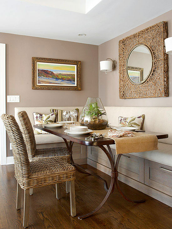
This is another example of how all the furniture on the rug visually creates the space. The dinning area is defined.
3- Front Feet on the rug:
Having just the front feet of the furniture on the rug creates that seamless design from the floor to the furniture…… but it also allows for the space to still be open and not quite as defined like the, all on, option above.
4- Layers, Layers, Layers
I feel like this one is probably one of the fastest and maybe most tricky ways to quickly add dimension and style to your decor.
The key to adding layers is balance. Mixing small pieces with large pieces BUT not having too much. A good rule of thumb is to never use objects smaller than a softball.
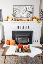
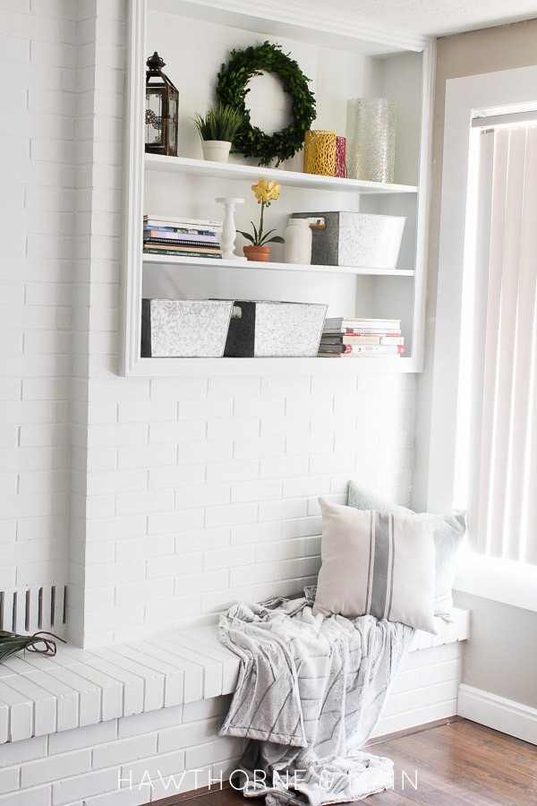
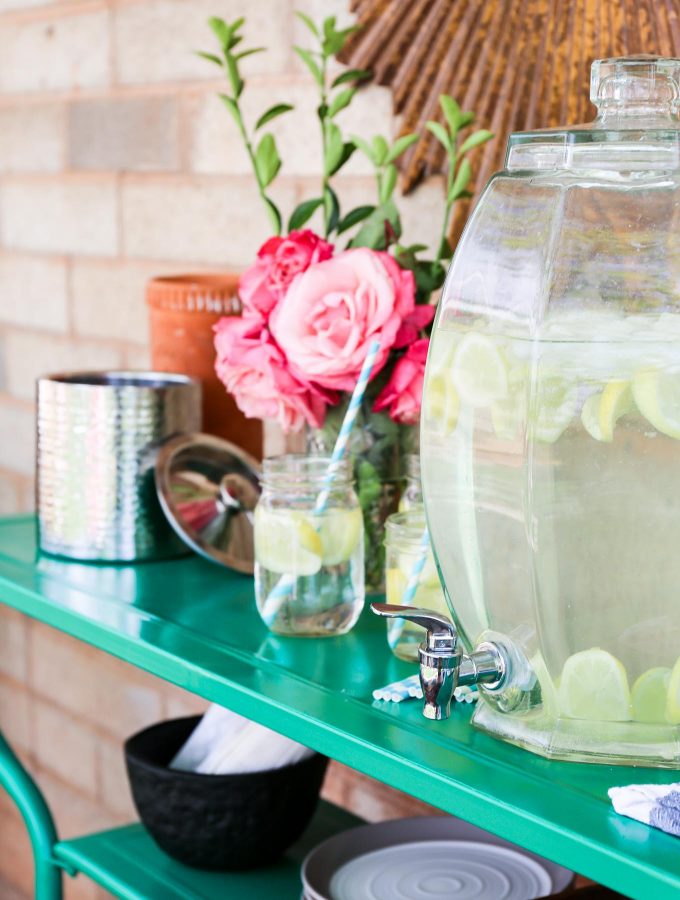
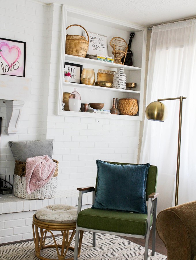
Go back and look at all of the images that I have shared in this post. You will see the many layers that have been incorporated into every space.
Here are a few things to add as layers if you are looking for ideas:
Flowers -Greenery -Personal Item( like photographs) -Pillows -Vessels -Baskets -Decorative bowls -Stacks of books -Throw Blankets -Large Empty Frames -Wall Art -Vintage Finds.
The best to get good at styling is to practice practice. Look at pretty pictures for inspiration and then jump in and see what works and doesn’t. You can use the picture method here, like I talked about with hanging art. I use it all the time to determine if what I have it too much.
I will be doing an entire post on how to style your shelves soon, stay tuned for that!
5- Paint Your Walls Last:
Say what…..? What did you just say?
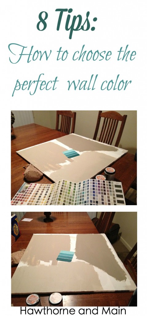
This might sound like an odd thing to do….. but hear me out. By choosing your design and decor first, you are able to then pull from those color tones to get the perfect wall color.
Let me give you an personal story to demonstrate this.
When we first moved into our house I picked the colors first….. I was a newbie back then.
I loved loved loved turquoise. I ran to the store, picked out the first turquoise that I saw and painted a giant wall in my house that color. Once we got all of our stuff moved in I could immediately tell that I had chosen the wrong color. It was pretty but not a good choice for our decor.
Let you decor help you choose the best wall color. If you want more tips on picking the perfect color check out this post. There is even a picture of the so called turquoise wall over there.
Even with everything that we have discussed today….
I think that creativity is king! If your design style is pulling you in a direction that is slightly contrary to what we have discussed then I say go for it, try it out. Not all spaces work the same way. Go with something that makes you happy and comfortable.
I would love to hear your thought and ups and downs of decorating in the comments below! You can also find me on Pinterest, Facebook and Instagram.


Great post! Question – do you have any good sources for some affordable plush good quality throw pillows? Mine don’t have the plush “chop” factor to them and I would love to get some nice ones and change out the covers. Thanks!
Thanks Christene! I was planning on doing a few follow up posts about pillows and throws. Be on the lookout for these soon. Thanks for stopping by!
Good info. I find that my problem are pillows on my leather couch. They rarely will stand up because of the slippery surface and also, when I have guests, the pillows are in their way and I’m not sure what I’m supposed to do with them? Usually I just tell them to throw them on the floor. Do you have a suggestion on what to do with a couch that reclines on each end? I haven’t purchased a coffee table yet because of this, but then anybody sitting on the couch has nowhere to set a drink. It’s quite frustrating.
Good questions Colleen. For the couch, I would choose a heavier fabric that has some weight to it. This will help hold them down. I don’t know what shapes you have for pillows right now, maybe try a shorter lumbar pillows. Also, the down pillows are heavier and tend to stay in place better. I agree that leather can be tricky. You can also put a throw blanket over the back of the couch and onto the seat cushion, then place a pillow on top of the throw. This would defiantly prevent the pillow sitting on the throw from sliding.
If you don’t want people to sit against your throw pillows then you can offer for them to move them. Otherwise people will usually sit against them or move them themselves. Either way is personal preference.
Having a coffee table in front of a reclining sofa can propose a problem. I don’t know how long your sofa is, but maybe you can get a shorter coffee table or maybe if you don’t have room for a coffee table you could focus on end tables. This way they would still have a place to set their beverages. I hope that I was able to give you a few suggestions to get the wheels turing. If you want to email be a picture of your space then I can have a better look at and maybe a few more ideas. Thanks so much for stopping by today!
H i Shonee,
This is such a great article…I will be pinning and referring to it in the future. It’s a nice little refresher on how to incorporate decor.
Hope you had a wonderful holiday season.
Much Love, ‘
Erica- Designing Vibes
Thanks Erica! Decorating can be tricky. You have got it down pretty well though I think. Your home is gorgeous. Thanks for stopping by and for pinning it! Have a great weekend!
My husband and I are downsizing since the children are out of college and out of their own. My problem is that the home we purchased has more of an open concept and the fireplace is in the dining area of the living room and I really don’t need two dining areas since the kitchen is large enough for my table, settee and chairs. I’ve always decorated around my sons and this time I plan on doing things a little different. Would it look odd if I just put a few comfy but moveable chairs in front of the fireplace? My living room is long and narrow. Any suggestions?
I know exactly what you mean. Both of my living rooms/dinning rooms are long and narrow. It is such a struggle. I think two chairs by the fireplace would be great. Recently I added a small couch in front of my fire place. Not sure if that is an option for you but it really makes the long narrow space feel more like two spaces. The dinning area is behind the couch with the fire place and sitting area in front of the couch…. does that make sense? Try moving the chairs to a couple of different spots until they just feel right. Good luck!
So many great tips! I’m still figuring out what to do with rugs in our dining/living rooms. I’ll definitely be looking back to these tips when it’s time to update those areas.
Thanks Leslie! It all takes time, and that’s ok. I think back on those times when I rushed into a design decision and I usually ended up regretting it. If you red my turquoise wall fiasco story then that is a good example of that. Just take your time. Thanks for stopping by today!
I love the tips. I learned the decorator chop a couple years ago and love the look.
Thanks Carolyn. There are so many little things that we can do to create a pretty space. Soft fluffy pillows are defiantly one of them. Thanks for stoping by!
Five great tips and SO much inspiration! Hanging artwork is something I’ve always struggled with! Pinning for sure! Thank you for sharing at The Wonderful Wednesday Blog Hop!
I used to hang my artwork too high. As I look back on older pics it sort of horrifies me. Live and learn. Thanks for stopping by!
These are awesome tips, definitely pinning. I love your tip about not decorating with anything smaller than a softball. It’s so true. I’ve tried too many times to admit, and it always looks like clutter, even when I group little things together.
I also agree with painting walls lasts, even though I often hear it suggested otherwise. I think it helps to live in a room, and see all the light phases it goes through before picking out a color.
Thanks Rebecca! It me a long time to realize that decorating with small objects made it looks cluttered. It is so tempting to jump on and paint a whole space. I have learned that patience is best, the paint color will usually be a better one. Thanks so much for stopping by!
I am always looking for more tips for decorating, I am great at creating things, but putting them all together is where I always get confused! You have inspired me to finally finish all the throw pillows I bought fabric for so I can add the necessary design to my living room. I would also love information on styling vignettes and shelves. I find that always stumps me!
Hey Kati! I agree that putting it all together can be challenging. I am so glad you are going to get your throw pillows done, they seriously make all the difference. I am planning on doing a post of styling vignette and shelves because those can really make or break a room. Thanks so much for your comment and for stopping by!
Great post Shonee! There are so many helpful tips and I really enjoyed reading it! Thank you so much for sharing with Dream. Create. Inspire. Link! I’m pinning your post!
Cat
Hey Cat thanks! Decorating has always been something that I love. Thanks for pinning!
i love this shonee girl!
Hey Lanie!! Thanks so much.
Great tips and I was really surprised by #5. Holly
Now you get fallout shelter game resources from here completely free of cost.