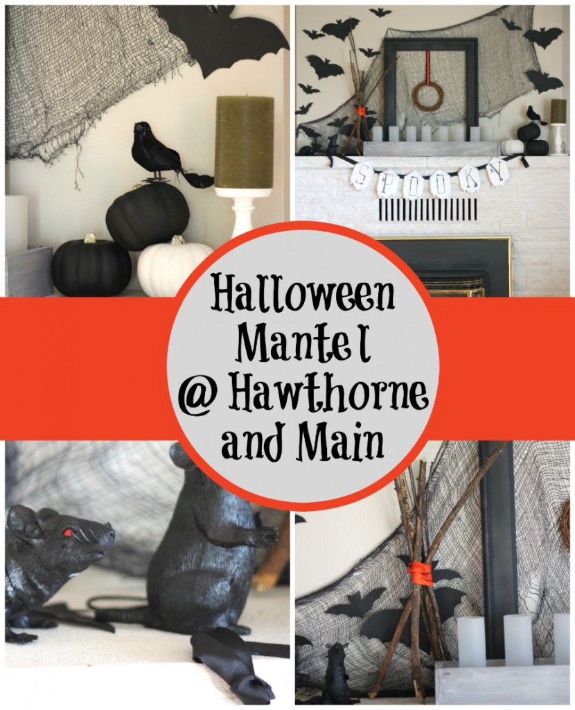
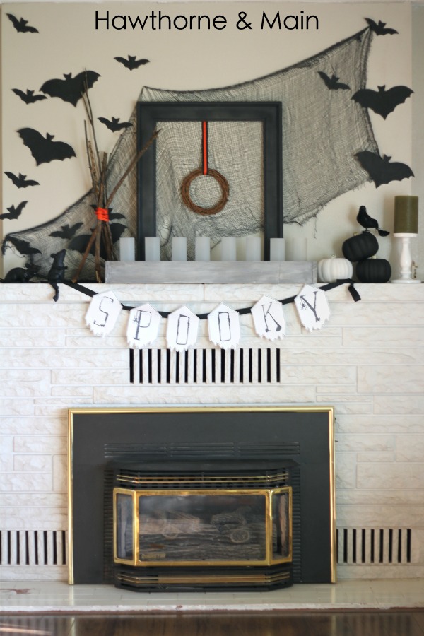
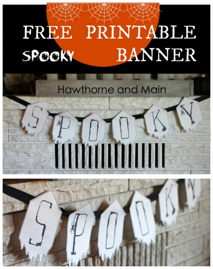
In the past I have not decorated my house very elaborate for Halloween, think, no decor except a pumpkin bowl full of candy! Earlier this week I shared my SPOOKY banner and today I am going to show you my process for decorating my Halloween mantel! Sadly, so far these are the only things in my house that resemble Halloween! I guess I am taking baby steps. Come get a peek inside my mind and see how I came up with the design for my Halloween Mantel.
To start off I needed to decide on a focal point. The focal point should be the largest piece in your design. A focal point could be a mirror, piece of art, or large clock. There are so many possibilities.
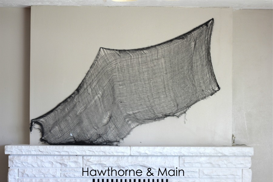
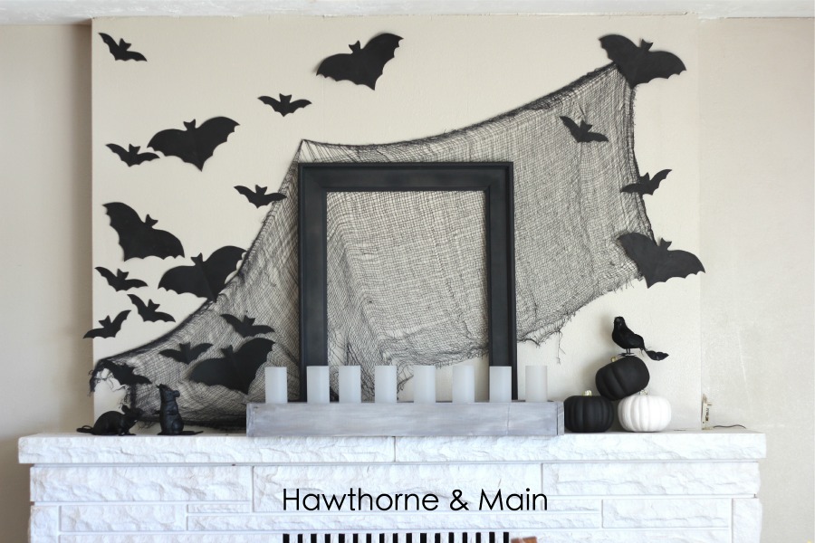
When it comes to Halloween decor I like semi-scary decor. I am not really into all the blood and gore but I do like it to look a little bit scary. I headed out to my local dollar store to see if they had any items that I could use. I was surprised to find quite a few items that would work. The first thing that I got was this awesome black netting. It was the perfect charcoal color and the strings were easily shreddable, which added great texture. I
used some finish nails to attach the netting to the wall.
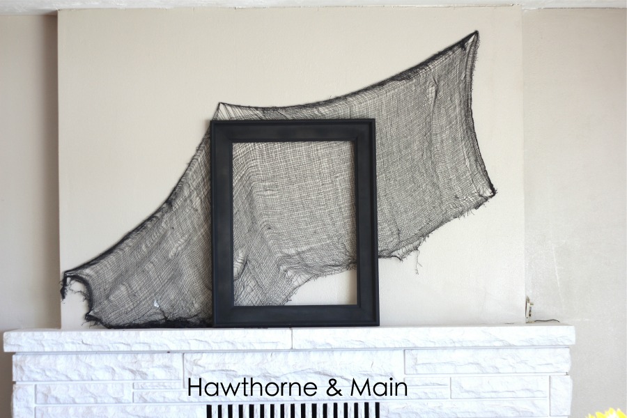
I found an old picture frame that I was no longer using and painted it with flat black spray paint. I put the freshly painted frame in front of the netting.
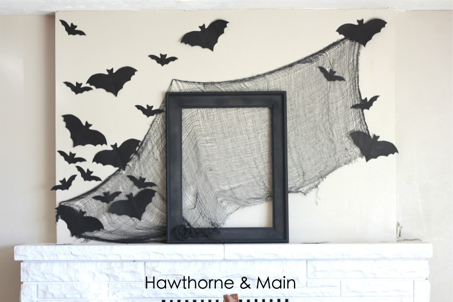
I then used some black card stock to draw some bats and cut them out. I attached these to the wall using tape. This finally completes my focal point. Usually the focal point is more center weighted and not quite so large. I decided to be a little bit more elaborate with this design. I honestly like the mantel like this but I took it a few steps further.
I decided I wanted to add a few more layers as well as visual weight. In other words I wanted to add some more accessories on the sides of the focal point. As a note, accessories should add dimension and detail, but never take away from the focal point.
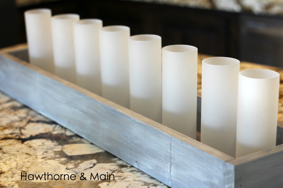
I made this little box a few weeks ago for a project that I never really got around to finishing. It’s still super cute so I added it to the mantel and I really like the look. The glass bottles that are in the box are tea light candle holders, this mantel will look awesome once all of those lights are lit up. I placed the box in front of the picture frame.
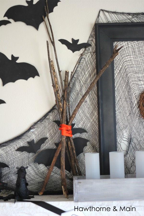
For the accessories, I went out to my backyard and found a few dead branches. I wrapped a bit of orange ribbon around the middle of the branches and stood them up on the left side of the picture frame. I also added 2 rats that I found at the dollar store. I am on the fence about keeping them, it seems a little bit cluttered on that side.
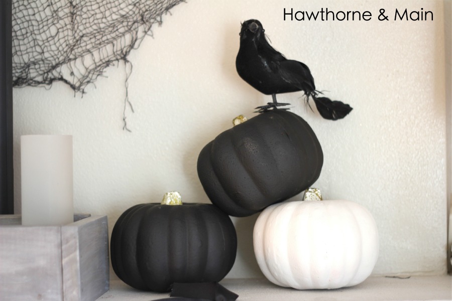
On the other side of the mantel I added three pumpkins and a black bird. This side of the mantel just felt like it was missing something, so I found this candle stick and green candle from another area of my house.
Once everything was said and done I still felt like something was missing!! Can you tell what I added?? I really like the look of blank picture frames and maybe if I had decided to have a couple more up there it would have worked. Since I just had the one up there I felt like I needed to add a bit of color to the frame. It was then that I rememebered that I had found this small grape vine wreath. It worked perfect to hang from the center of the frame.
Well there you have it!! My first Halloween mantel. I am really liking how it turned out.






Your mantle is great! I love how you documented the progress, and that it was all black and white until the very end. I think my favorite part is the bats! For this being your first time decorating for Halloween, I'd say you nailed it!
Thanks Melanie! I really liked it all black and white too. I actually left it like that for a couple of days before I decided to add a bit of color. I just love color so much that I need to add at least a little bit!
I LOVE this, Shonee!! I love the black and white with little bits of color here and there. The bats are PERFECT, too!! Such a great job!! 🙂
Your mantel looks great! It all comes together perfectly.
You did such a great job on your mantel. The black and white is perfect and I just love all the bats and the "spooky" banner! Thanks so much for linking up to Your Designs This Time, pinned to our favorites and features board!
Fabulous! The piece of fabric stretched on the wall turns this whole mantel into a showstopper! It adds such a nice backdrop to the entire display. Thanks for taking us step by step so that we could recreate this look!
Your mantel looks so great! I’m also the kind of person who don’t like bloody and too creepy decoration in Halloween. Your design is my jam, thank you for the tutorial, it’s very helpful for me.